My last couple of posts (here and here) have focused on some of the details that came out of the Climategate scandal. Specifically, I’ve presented evidence from the leaked emails and source code showing that:
- Various questionable techniques and datasets were being used in the CRU’s models.
- Source code was written in such a way as to specifically weight and outright change data to achieve desired effects.
- There was an active conspiracy to prevent the raw temperature data from being released to outsiders. This included, but was not limited to, intentionally deleting content after Freedom of Information Act requests had been initiated.
- Ethically questionable steps were taken which did subvert the scientific process. This included controlling which papers got published (only those sympathetic to ‘the cause’), undermining journals and editors who published papers critical of man-made global warming, and direct attacks against ‘skeptics’.
The Question Remains
But the question remains: Is there actually man-made global warming taking place?
Just because we know the scientists in the paleo-climate arena have been manipulating the data and public opinion, we cannot conclude that global warming is a myth.
One thing is clear: In our search to answer this question we must be extremely wary of the type of data we’re willing to consider. In particular we need to look out for:
- Any temperature data that is derived (i.e. proxy data like tree-rings and ice cores). These proxies are provably affected by factors other than temperature. Refer to part one of this series for a discussion on the tree-ring divergence problem.
- Any data that has been statistically manipulated. We have already scratched the surface of how statistical analysis can be used to serve agendas. This is especially true in the paleo-climate world where principal component, regression, and other complex transformations are applied to data. See A.W. Monford’s excellent book ‘The Hockey Stick Illusion: Climategate and the Corruption of Science‘ for a detailed discussion of exactly the kinds of statistical games that get played in paleo-climate circles.
Raw Temperature Data
So what are we left with? Well, the obvious thing that remains is the historical raw temperature data from various impartial meteorological institutions. These raw datasets are readily obtained and have results stretching, in some cases, all the way back to around 1850. These datasets are a good starting point to understand if, at least in the context of recent history, current temperatures are abnormal.
In all cases except where noted, the monthly mean temperature is used. This is defined simply as the average of the maximum and minimum temperature at a location for the days of the given month. This measure gives us a simple, reliable representation of the average temperature for that location for the target month. My Excel spreadsheet with all data and charts can be downloaded here.
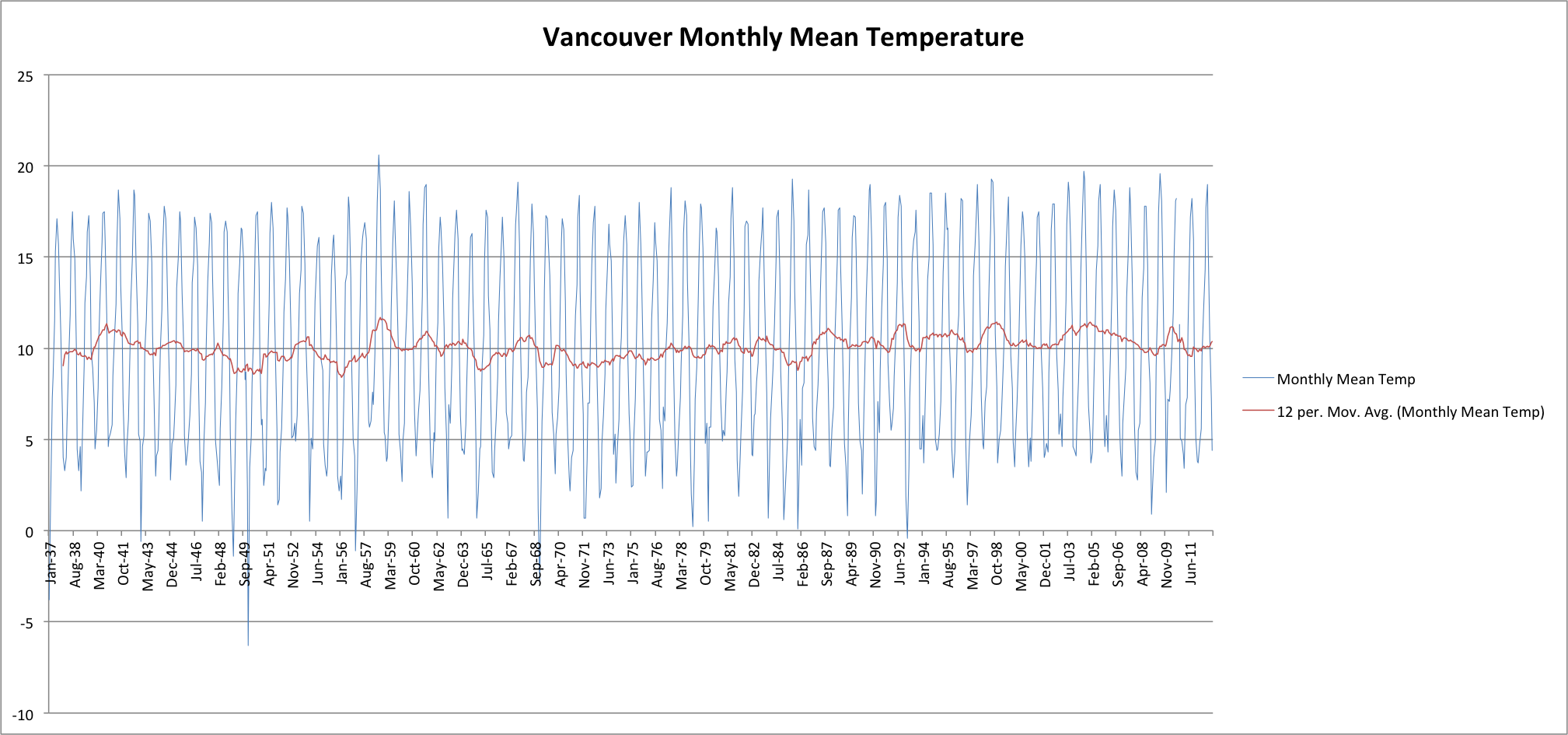
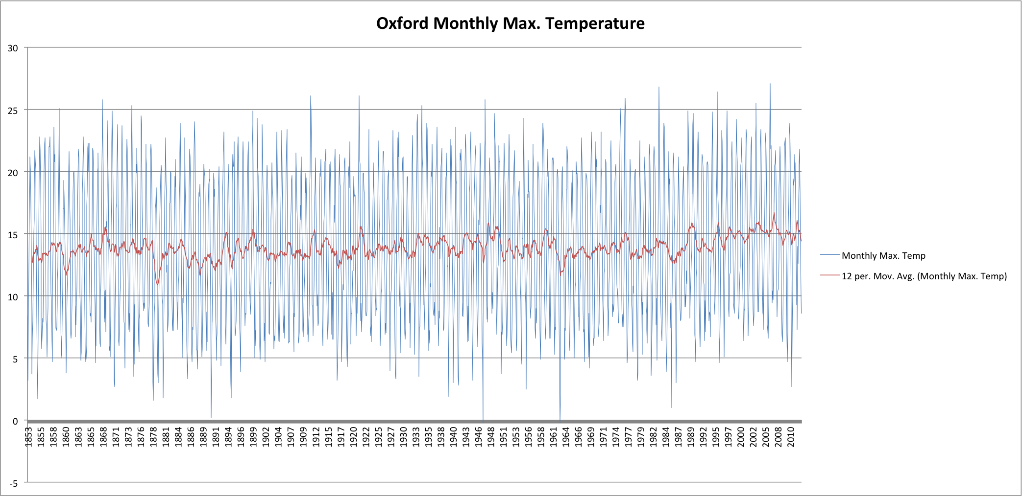
Also graphed (in red) is a 12 month moving average trend line. This trend line represents the annual mean temperature and makes it much easier to pick out any overall increase or decrease in the series.
First up, the temperatures from my hometown of Ottawa, Canada (courtesy of Environment Canada):

Next, let’s head over to the Pacific coast and Vancouver, Canada (courtesy of Environment Canada):
Unfortunately, the Environment Canada data doesn’t go back before the 1930’s. Let’s look at a random sampling of datasets which go back further starting with New York, New York (courtesy of NOAA):
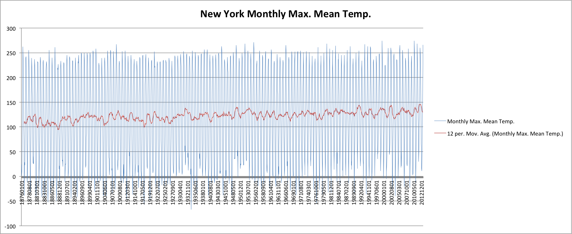
Note: The unit here is unknown. This is the raw data from NOAA. Clearly it is not fahrenheit. Nonetheless, it does provide a nice trend line against instrument data stretching back into the 1800s.
Next, let’s head across the Atlantic and look at Oxford, England:
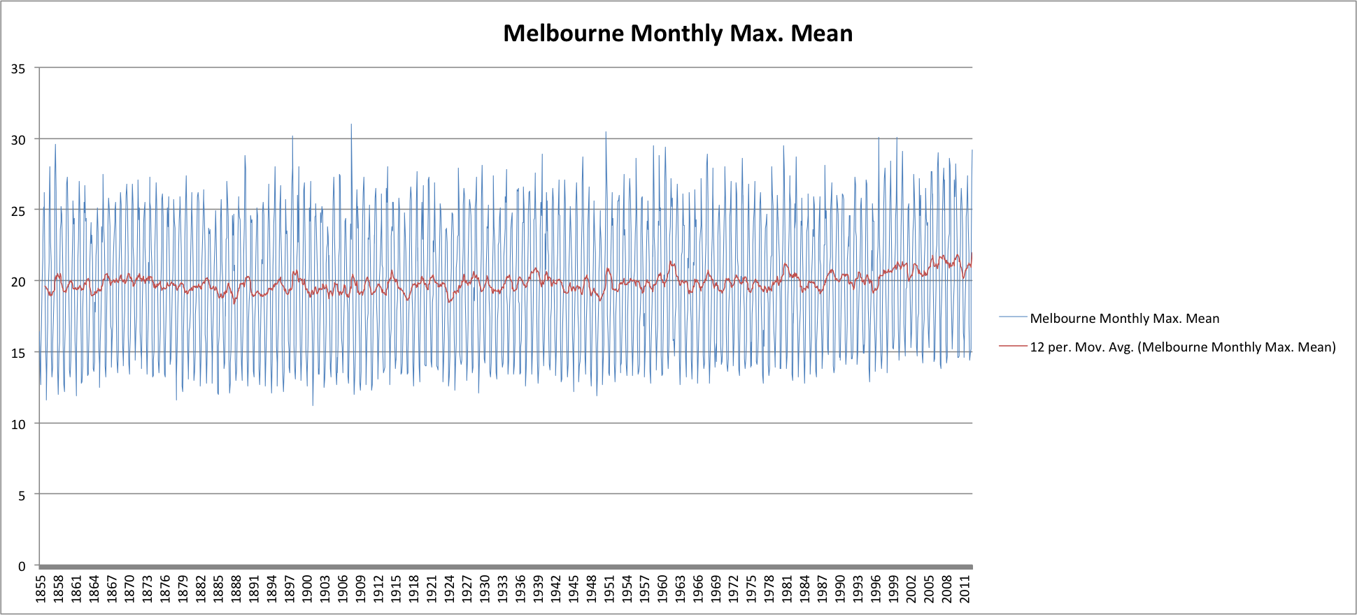
Finally let’s take a look at Melbourne, Australia (courtesy of the Australian Bureau of Meteorology):
Raw Temperature Data Conclusions
What, if anything, can we conclude from the raw temperature data?
Well, I think we can see that, in general, there has indeed been a slight increase in average temperatures over the last few decades. By playing around with my charts and applying linear trend-lines I quantify this as being about one degree Celsius over the entire 160 year period back to the 1850s. This is relatively consistent between locations and thus, I conclude, represents a small but real and global warming over that period.
Take a Step Back
Now take a step back. What have we actually shown? Only that temperatures over the last couple of decades have increased slightly above the average for the previous 150 or so years.
From this limited data we can certainly not conclude that man-made carbon dioxide emissions are causing global warming. In addition to the fact that we can in no way establish any type of causal relationship from such a limited study, there are other known factors that can skew temperatures.
For example there’s an effect known as the urban heat island (UHI) effect. UHI is a well documented phenomenon whereby metropolitan areas tend to have higher temperatures than surrounding areas since they are constructed from materials that have high heat retention (concrete). Given that all my datasets are for urban centres that, over the span of the data, became more built up, we would expect to see the UHI effect cause some increase in temperature.
And let’s not forget the influence of the sun (which I will focus on in a future post), the Earth’s orbital variations (obliquity, precession, Milankovitch cycles, etc.), volcanic activity, etc.
The point is there are many things that can cause temperatures to fluctuate over time. We can’t possibly conclude that the very small increase we’re currently observing is the result of man-made carbon emissions.
Are Current Temperatures Unprecedented?
The logical continuation of this discussion is to look at whether the current temperatures have any precedence in the relatively recent history of our planet.
Here we head into dangerous territory since we must go beyond the instrument record and look deeper into our planet’s past. In doing so we must guard against relying solely on proxy data since we’ve seen how such data is easily misused.
With that caution in mind let’s look at an obvious candidate: The Medieval Warm Period.
The Medieval Warm Period and Little Ice Age
One of the many major criticisms of the infamous hockey stick chart from Climategate, was the absence of the Medieval Warm Period (MWP). This was a huge departure from the established consensus within the scientific community and the opinion of the IPCC (UN International Panel on Climate Change) at the time. Here’s how the IPCC conclusions evolved over the years to eliminate the previously accepted MWP:
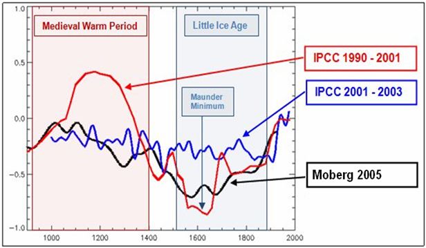
As you can see, with the release of Michael Mann’s hockey stick, the MWP was expunged from the IPCC temperature record. The effect is obvious. With the MWP included current temperatures do not appear abnormal or unprecedented. But, with the MWP removed, current temperatures appear much more concerning.
So which is correct? Did the MWP really occur?
I think there are many obvious data points that indicate the MWP was a real event. Its removal from the temperature record by Mann et. al., and the subsequent adoption by the IPCC of this bastardization of climate history is, in my mind, an amazing example of statistics and obfuscation being used for political and personal motives.
On the statistical side of things, the previously mentioned book by Montford goes into all the juicy details. I would highly recommend this book for anyone who wants to really understand the game that Mann and others on ‘the hockey stick team’ played. After reading this book there is no doubt in my mind that Mann’s hockey stick chart was based on completely flawed data and intentionally flawed analysis of that data to remove the MWP and exaggerate current temperature trends. This is not opinion but proven fact. There is simply no way to spin Mann’s techniques in a favourable light. Indeed, understanding the machinations Mann had to go through to abolish the MWP from his chart is itself strong evidence that the MWP is real.
There is much evidence in the scientific literature that supports the existence of the MWP as well as the Little Ice Age (LIA) that followed. A great summary of this evidence can be found here.
As a further point of evidence supporting the MWP and LIA, I would point to the Viking colonization of Greenland, Iceland and parts of Newfoundland:
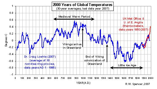
We all learned about the Vikings in school. It’s historical fact that the Vikings did establish colonies on Greenland and Iceland that coincided with the MWP only to abandon these colonies with the onset of colder temperatures during the LIA. It’s also interesting to see in the above chart the divergence problem I talked about in my first Climategate post.
Given the vast body of evidence supporting the existence of a MWP and LIA, I do not believe the existence of these periods of temperature fluctuation can be refuted. Thus, Mann and the current IPCC temperature reconstructions that do not show a pronounced MWP are, in my mind, highly suspect and must be based on flawed data, flawed analysis or a combination of both.
Pre-civilization Temperature Record
Let’s step back still further into the temperature record. In doing so let’s remain mindful that we’re relying on temperature proxies. But, that said, what’s the current understanding of our planet’s recent history?
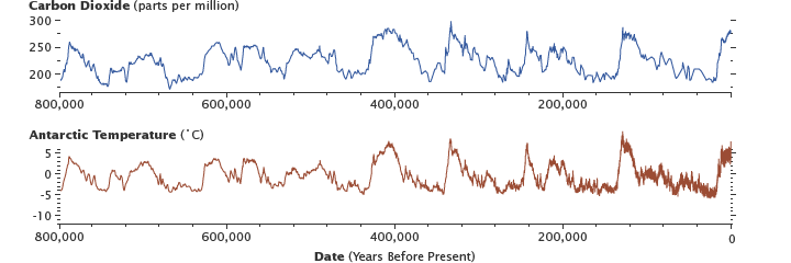
Here’s a look back 800,000 years courtesy of NASA (using antarctic ice-core data):
Going back further into the temperature record:
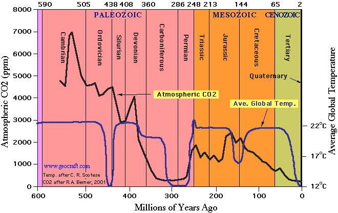
I think we all remember something like this from our high-school textbooks. It fits with what we all know intuitively – that it was much warming during the age of the dinosaurs than today.
This chart also shows us that large scale temperature fluctuations are totally normal for our planet. In fact, we’re currently at what would be considered the bottom of the long term temperature range (far below temperatures of the past).
Clearly the previous climate changes were not anthropogenic since we, homo sapiens, weren’t around. The inescapable conclusion must be that even in the absence of human influences, our planet’s temperatures are volatile.
Conclusions
The conclusion that temperatures have increased slightly over the last hundred years (about one degree Celsius) is support by the raw temperature data.
The conclusions that this warming is unprecedented and man-made are not supported by the data.
We know that there were both a Medieval Warm Period and Little Ice Age in the last Millennium. We know that the temperature record for the last million, or hundreds of millions of years reveals cyclical temperature variations which could obviously not be man-made. Temperatures during these periods did regularly exceed by a large margin anything even close to what we see today.
These conclusions do not give us the right to pollute our planet with impunity. But they do call into question the global warming phenomena as the most pressing danger mankind faces. We have been mislead and outright lied to. The science has been corrupted. We need to question the conclusion of global warming and cast a critical eye on the policies that are being put in place on the basis of perhaps the greatest con in human history.
You may also like:
- Climategate Part Two: The Undermining of the Scientific Method
The scientists involved in Climategate knew their conclusions were based on faulty data and a rigged climate model. These scientists engaged in a systematic and coordinated campaign to prevent their data and model methodologies from being made known. This campaign extended to blatant obstruction of Freedom of Information Act requests. Worst of all, these global warming advocates assaulted the core principals of the scientific method by attacking the peer-review process itself. By pressuring journals and editors to publish papers supporting the ’cause’ while blocking publication of ‘dissenting’ papers, proper scientific debate, the means by which we arrive at the truth, was quashed.
- Climategate Part One: Overview, Tree Rings and the Divergence Problem,…
An overview of Climategate, the role of tree ring data and the divergence problem. Details how the CRU manipulated the raw data to hide the divergence problem and generate the infamous ‘hockey stick’ graph.
- Bondpocalypse
The 30 year bull market in bonds is coming to an end. Attempts to keep the financial system from collapsing over the last five years have merely set the stage for a larger collapse. Government debts have exploded. Central banks have desperately lowered interest rates to near-zero and resorted to outright monetization of the debt. Recent events show us that the mere suggestion of possible future tapering is enough to cause an immediate and violent reaction in bond yields.
There’s no way out. The bondpocalypse come’th.
Hi Greg – how do I get a hold of you? I have a local start up online newspaper in Bradford, Ontario that is Libertarian leaning, and I have a few questions to ask you about Bail In scenario, etc.
Thanks
Brian
bhayden75@rogers.com
Hi Brian,
I’ve sent an email to your rogers account so we can chat.
Kind regards,
Greg